If you’ve watched my tutorials for a while, you’ve probably noticed that I rarely use black watercolor.
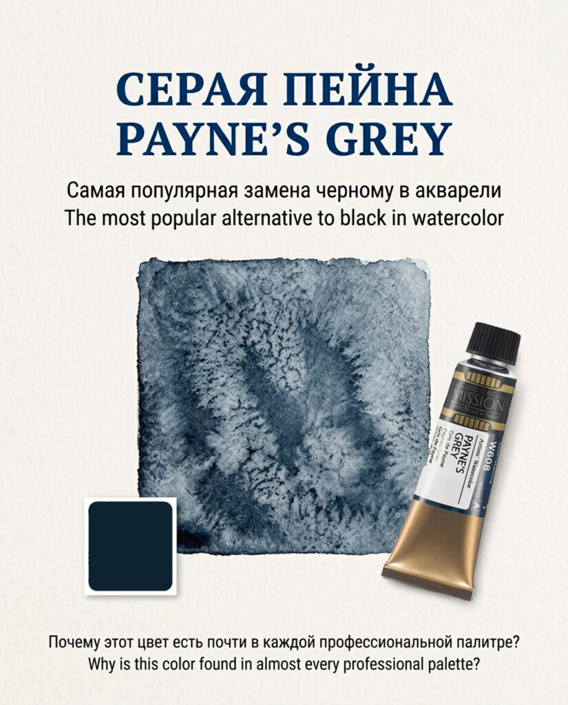
For deep shadows, dark accents, and neutralizing mixtures, I almost always reach for Payne’s Grey instead.
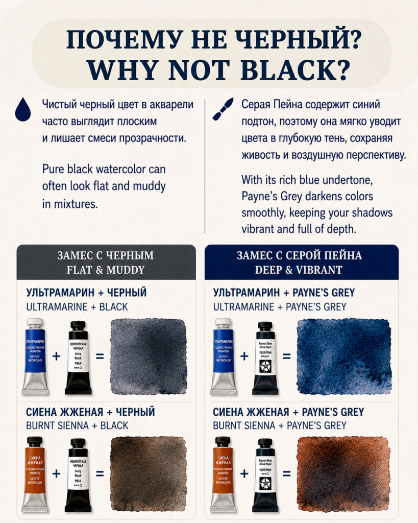
The reason is simple: pure black often makes watercolor mixtures look heavy and lifeless. Payne’s Grey creates depth in a much more natural way while preserving transparency and color harmony.
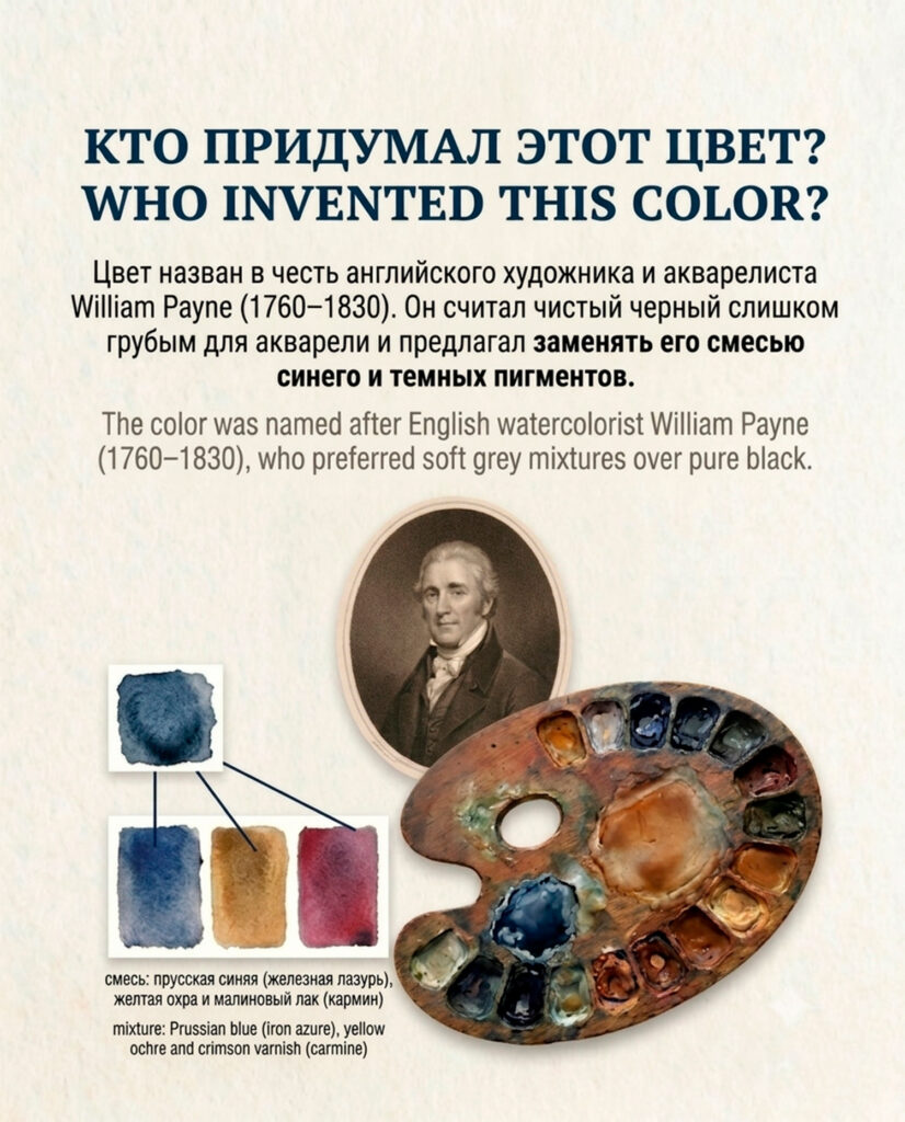
Interestingly, Payne’s Grey is named after the English watercolorist William Payne (1760–1830), who believed that black was too harsh for landscape painting. Instead, he recommended mixing blue with dark pigments to create softer, more atmospheric shadows.
Today, Payne’s Grey remains one of the most popular colors among watercolor artists—but there is one important detail many painters don’t realize:
Payne’s Grey is not a pigment.
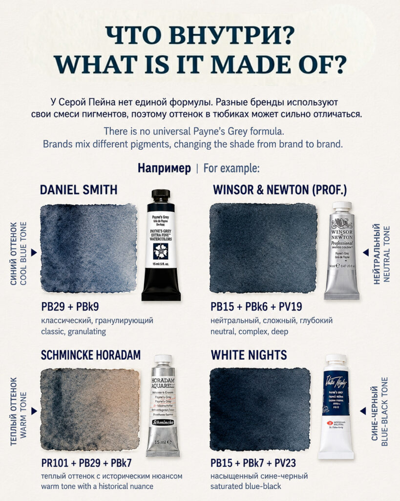
It is a convenience mixture, and every manufacturer creates it differently.
That means two tubes labeled “Payne’s Grey” can behave completely differently on paper.
For example:
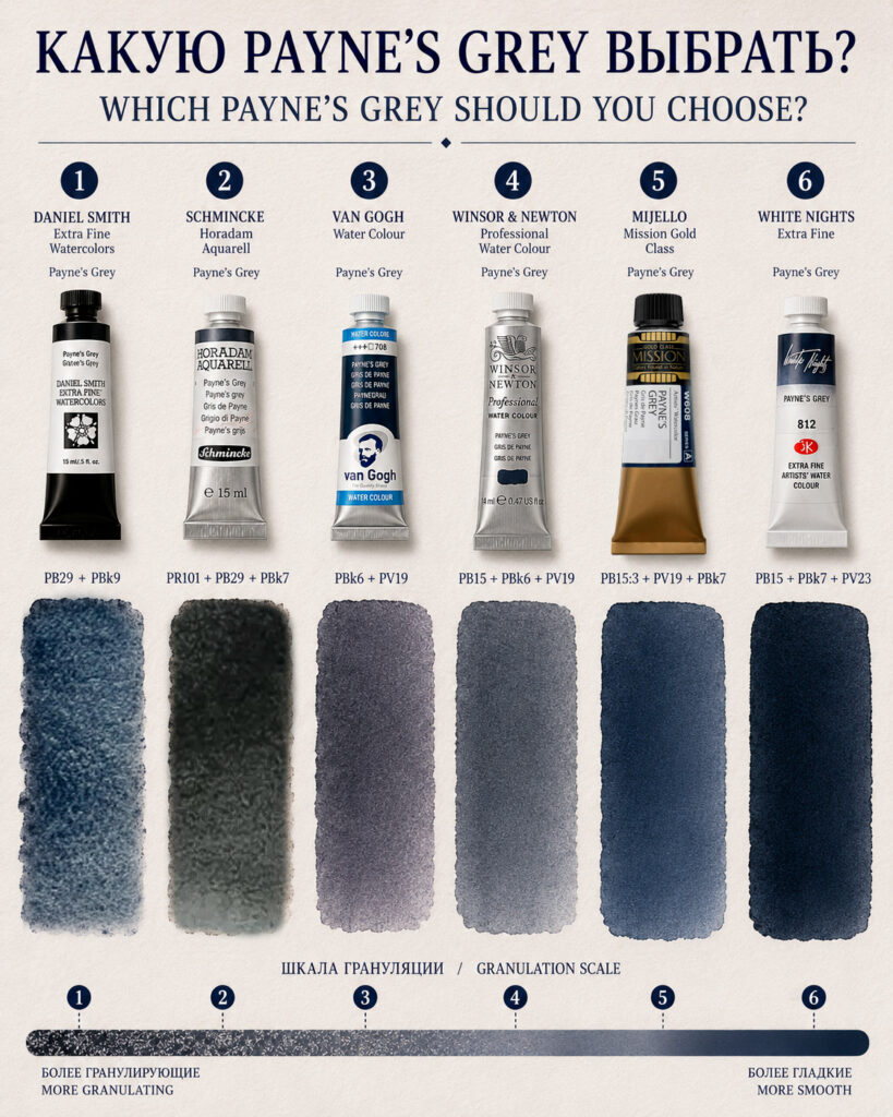
🔹 Daniel Smith uses PB29 (Ultramarine) and PBk9 (Ivory Black). The result is a beautifully granulating, textured grey that works wonderfully for rocks, mountains, and natural landscapes.
🔹 Schmincke Horadam adds PR101 (Red Iron Oxide), creating a warmer and slightly earthy interpretation. It feels very traditional and atmospheric.
🔹 Winsor & Newton Professional combines PB15, PBk6, and PV19. This version produces smooth washes and a deep neutral grey with subtle color complexity.
🔹 Mijello Mission Gold is one of my personal favorites because of its distinctly blue character. The PB15:3-based formula creates luminous darks that never feel dull.
🔹 Van Gogh takes a different approach. Its mixture of PBk6 and PV19 creates an unusual violet-grey undertone that can be very beautiful in moody subjects and evening scenes.
One interesting pattern you’ll notice when comparing different brands:
✔ Payne’s Grey mixtures based on PB29 Ultramarine tend to granulate more.
✔ Versions dominated by PB15 Phthalo Blue are usually smoother and more uniform.
✔ Formulas containing violet pigments often produce richer and more atmospheric shadow colors.
This is why I always recommend checking the pigment codes on the tube rather than relying on the color name alone.
For this month’s reference post, I compared several popular versions of Payne’s Grey side by side, including their pigment compositions, granulation characteristics, and overall color bias.
My goal isn’t to tell you which one is “best”—it’s to help you choose the version that fits your own painting style.
Do you keep Payne’s Grey in your palette, or do you prefer mixing your own greys from complementary colors?
I’d love to hear your thoughts in the comments. 💙