
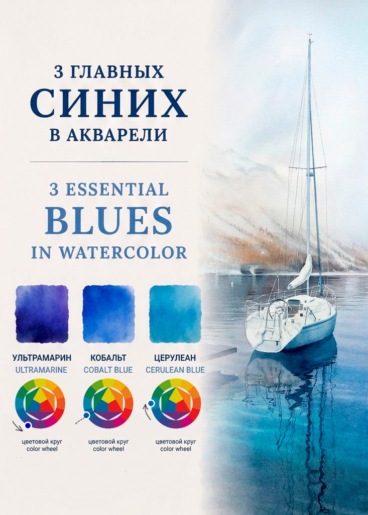
Многие начинающие художники путают оттенки синего, в палитре они выглядят похожими, но на практике это совершенно разные цвета. Ультрамарин, кобальт и церулеан обладают совершенно разным характером, историей и поведением в смесях.
Понимание их колористики и свойств пигментов поможет вам осознанно выбирать краски и получать более предсказуемый результат в живописи.
1. Ультрамарин
Пигмент: PB29
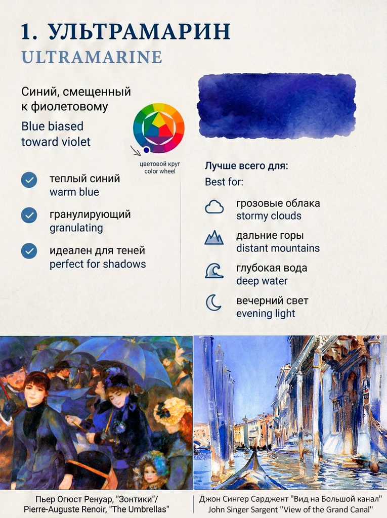
Ультрамарин — это синий цвет со смещением в сторону фиолетового. Исторически его получали путём измельчения натурального лазурита — полудрагоценного камня, который привозили из Афганистана. В эпоху Возрождения натуральный ультрамарин нередко стоил дороже золота и использовался только для самых важных частей картины.
Характеристики
✔ Warm blue (toward violet)
✔ Strong granulation
✔ Transparent
✔ Excellent for shadows and atmospheric effects
Famous examples
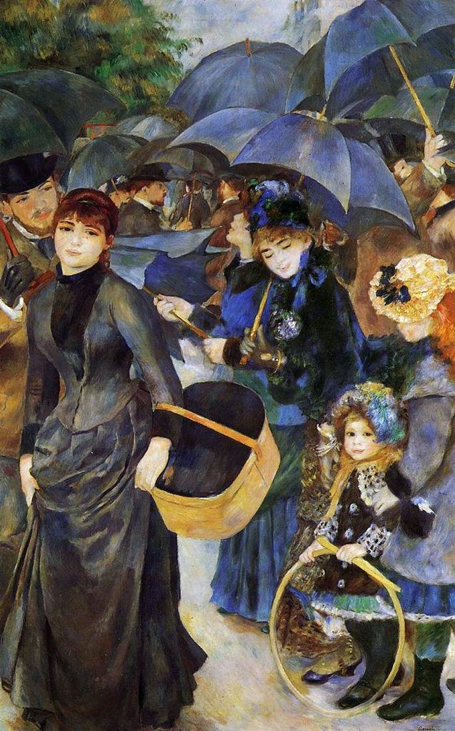
- Pierre-Auguste Renoir — The Umbrellas
- Vincent van Gogh — The Starry Night
Best used for
- Stormy skies
- Distant mountains
- Deep water
- Evening light
- Mixing rich violets
2. Cobalt Blue
Pigment: PB28
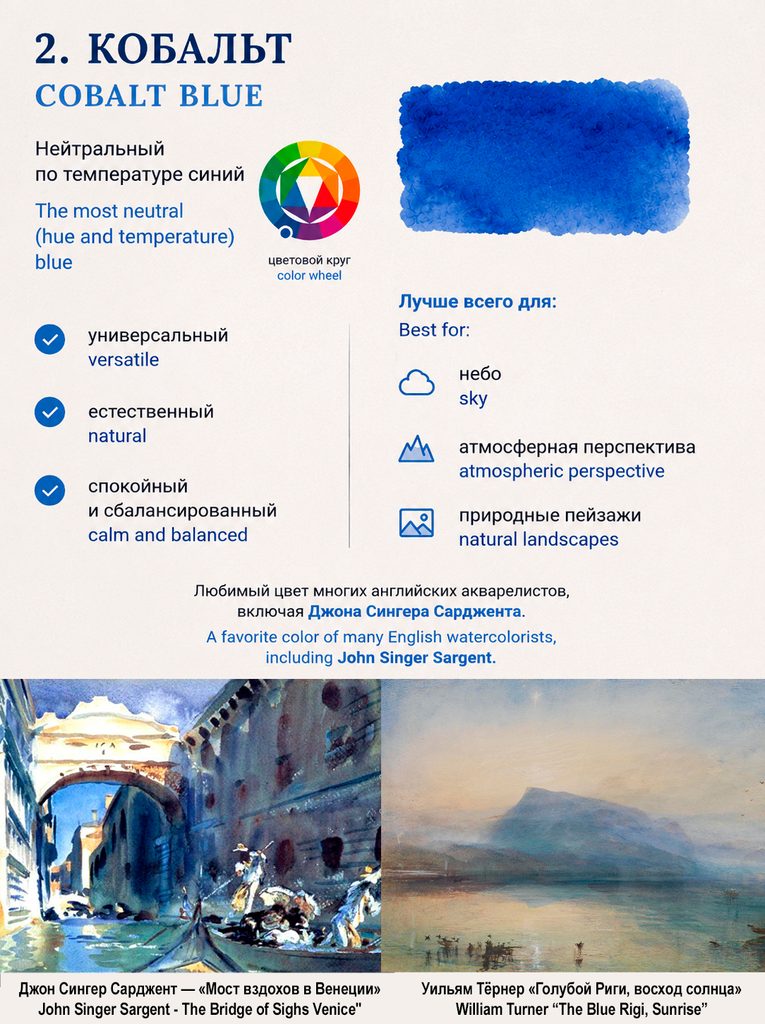
Cobalt Blue was discovered in the early 19th century and quickly became popular among landscape painters. Unlike Ultramarine and Cerulean, it sits almost exactly in the middle of the blue spectrum, making it one of the most neutral blues available.
Many watercolorists consider it the most versatile blue because it rarely dominates mixtures.
Characteristics
✔ Neutral temperature blue
✔ Gentle granulation
✔ Soft, natural appearance
✔ Excellent mixer
Famous examples
- William Turner — The Blue Rigi, Sunrise
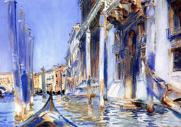
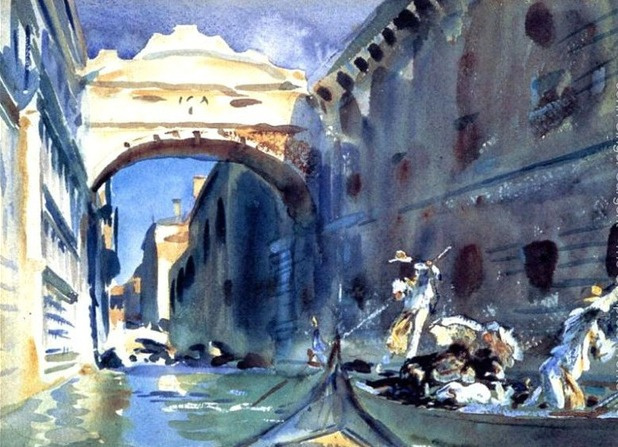
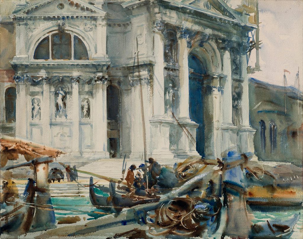
- John Singer Sargent — Venetian watercolors
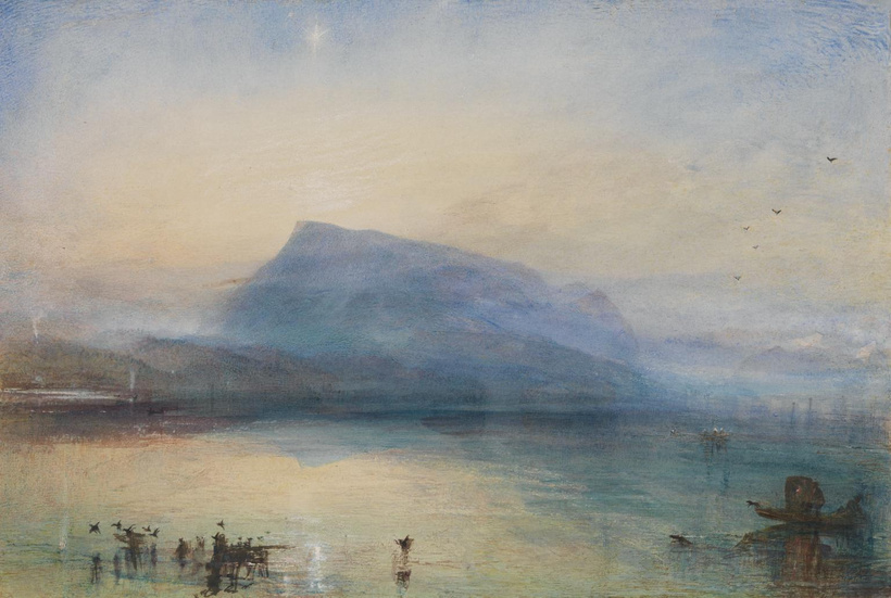
William Turner’s late studies – in his experimental, almost abstract watercolours of the 1840s (when the pigment was still being tested), Turner applied subtle washes of cerulean over yellow ochre, creating the effect of diffused sunlight filtering through coastal mist.
Best used for
- Natural skies
- Atmospheric perspective
- Landscapes
- Soft shadows
- Balanced color mixtures
3. Cerulean Blue
Pigments: PB35 or PB36
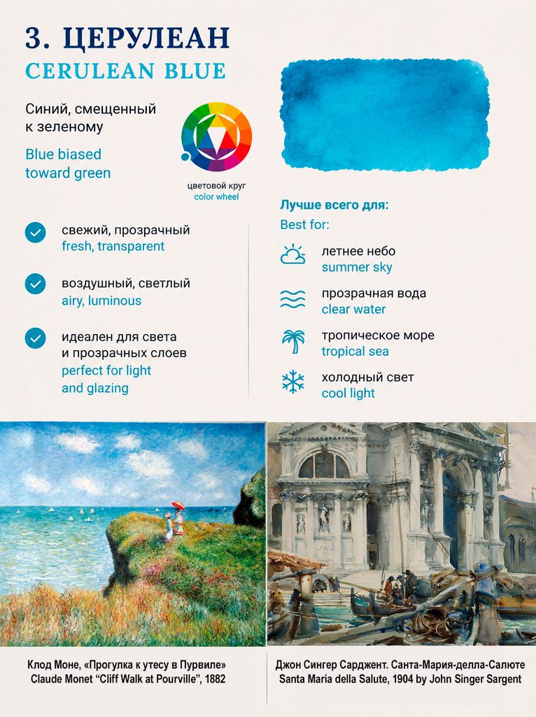
Cerulean Blue is shifted toward green and is often considered the classic “sky blue.” It became widely available during the 19th century and changed the way artists painted air, distance, and sunlight.
Compared to Ultramarine, Cerulean appears lighter, cooler, and more luminous.
Characteristics
✔ Blue biased toward green
✔ Granulating
✔ Opaque to semi-opaque
✔ Naturally atmospheric
Famous examples
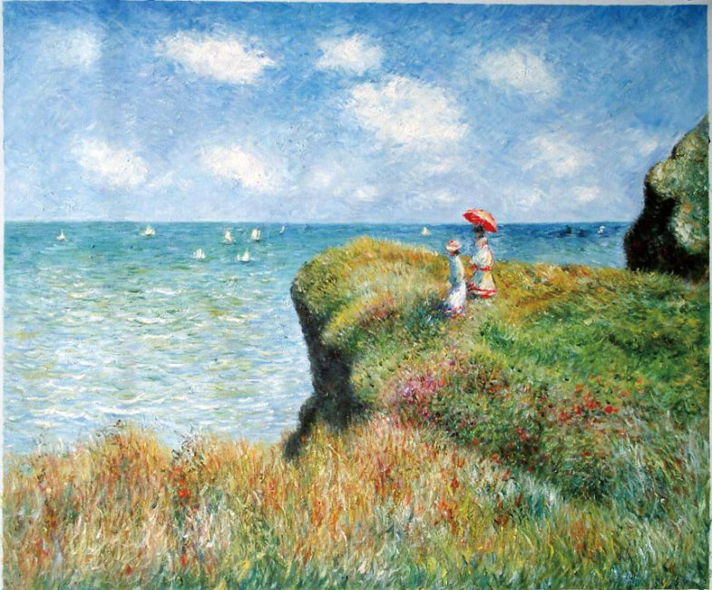
- Claude Monet — Cliff Walk at Pourville
- John Singer Sargent — Santa Maria della Salute
Best used for
- Summer skies
- Clear water
- Tropical seas
- Cool daylight
- Air and distance effects
Which Blue Is the Coolest?
This question often surprises artists.
Many beginners assume that Cerulean is the coolest because it looks bright and turquoise. Others choose Ultramarine because it feels deep and intense.
From a color theory perspective, however, Cobalt Blue is generally considered the coolest of the three.
Why?
- Ultramarine contains a noticeable violet bias, which pushes it toward the warm side of the blue family.
- Cerulean contains a green bias, which also moves it away from a neutral blue.
- Cobalt Blue sits closest to the center between violet and green, making it the most neutral blue hue.
In other words, Cobalt is neither violet-blue nor green-blue. It occupies the middle ground.
This is why many artists find Cobalt Blue indispensable for natural-looking skies, atmospheric perspective, and harmonious color mixtures.
A Practical Recommendation
If you could only own three blues, I would recommend:
🎨 PB29 Ultramarine Blue — for depth, shadows, and dramatic effects
🎨 PB28 Cobalt Blue — for versatility and natural landscapes
🎨 PB35/PB36 Cerulean Blue — for skies, water, and luminous passages
Together they form an excellent “blue triangle” that covers almost every situation you’ll encounter in watercolor painting.
Which of these blues do you use most often in your palette, and why? 💙

