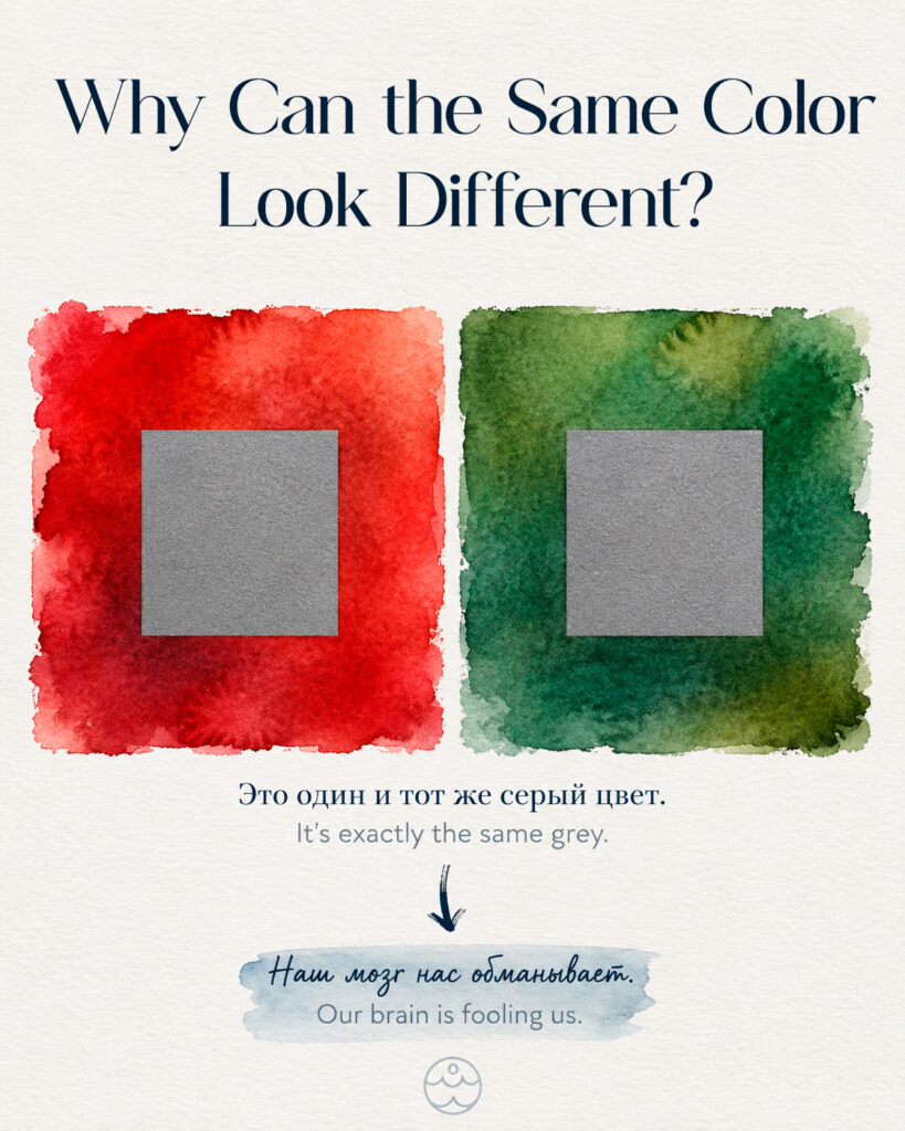
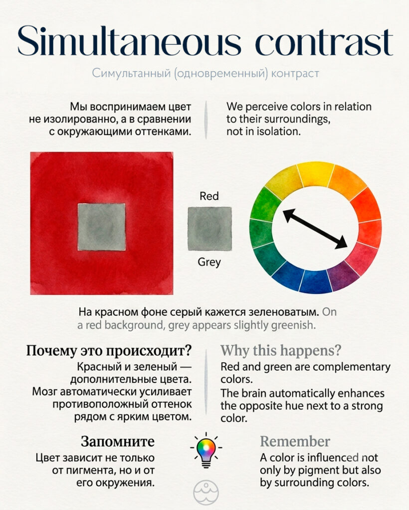
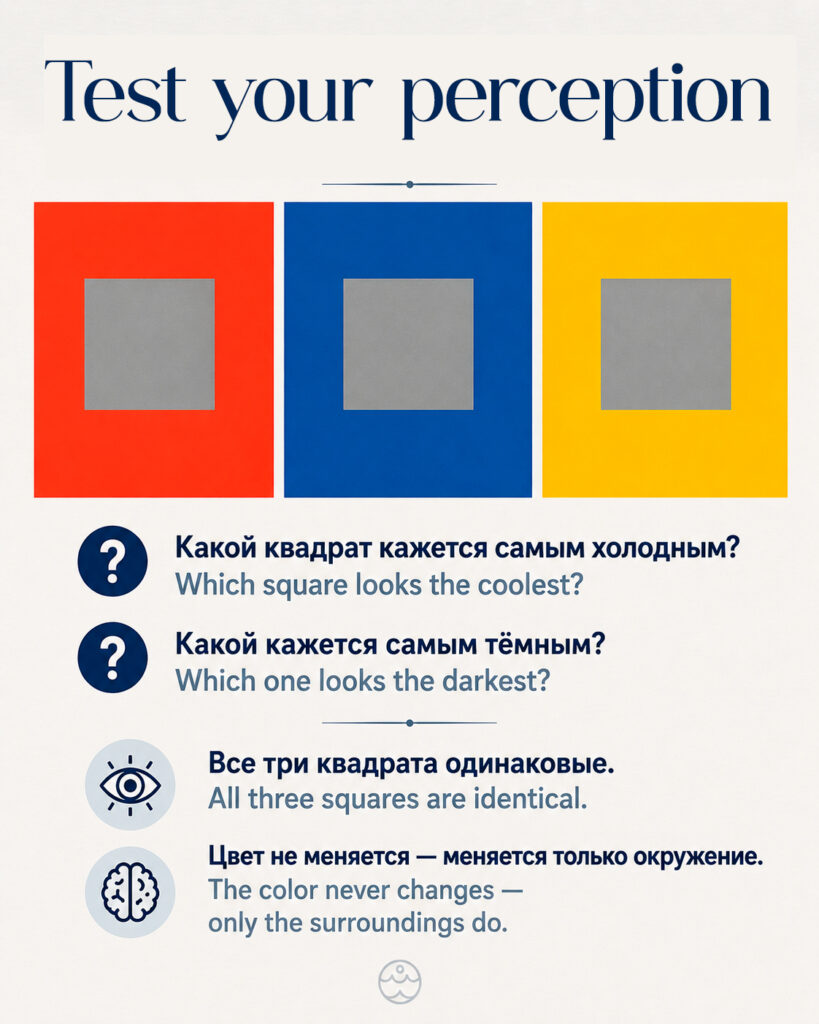
Have you ever noticed that a gray square placed on a red background can appear slightly greenish, while the very same gray on a blue background seems warmer? The color itself hasn’t changed — only its surroundings have.
This phenomenon is called simultaneous contrast, and it is considered one of the most important principles of color theory.
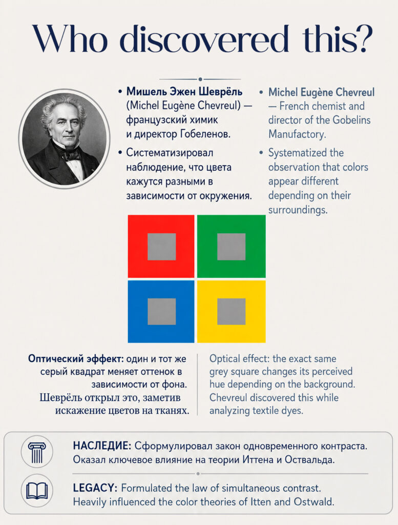
It was first described in detail by the French chemist Michel Eugène Chevreul in the 19th century. While working for a tapestry manufacturer, he observed that craftsmen often blamed dye quality for color problems, when in fact the issue was how neighboring colors influenced one another. His research became one of the foundations of modern color theory and was later expanded by artists and educators such as Johannes Itten.
Why does this happen?
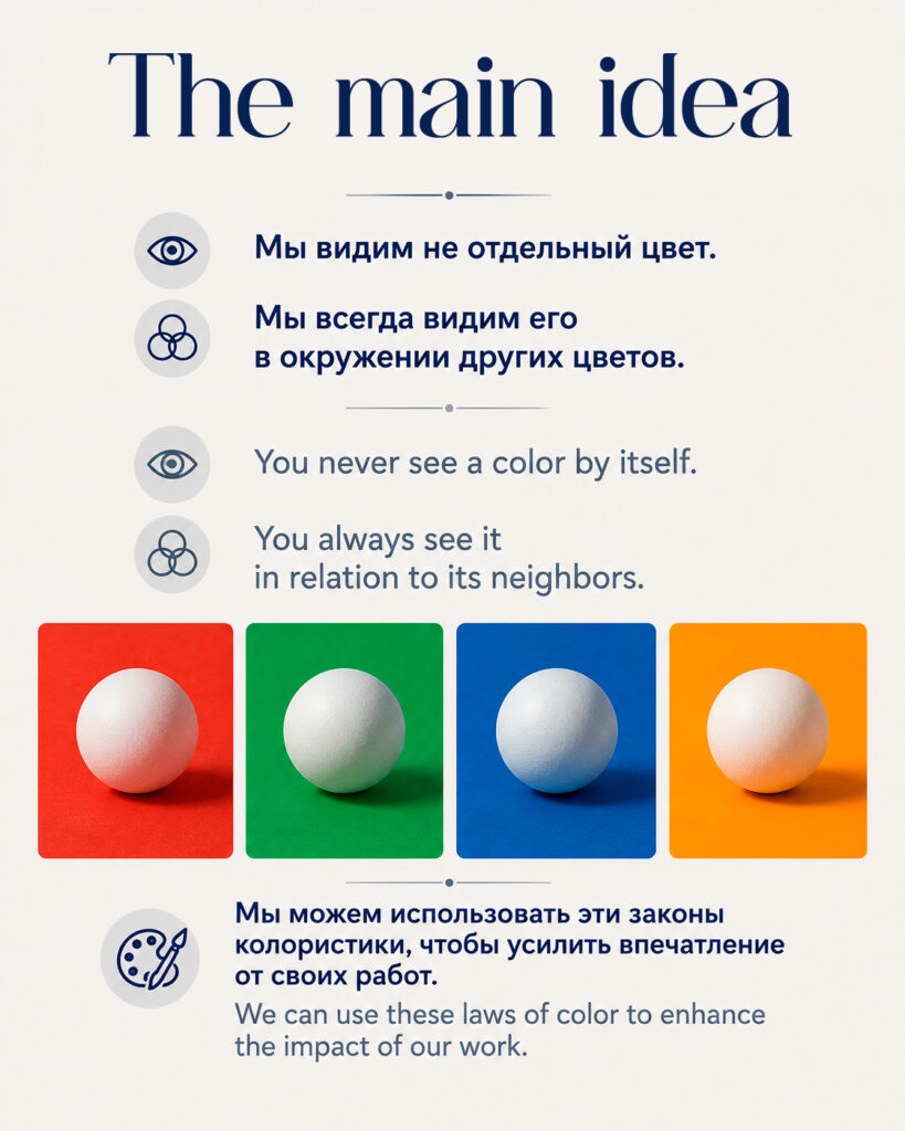
Our eyes constantly seek color balance. When we look at a strong color, our visual system automatically enhances its complementary opposite. As a result, a neutral gray may appear slightly greenish next to red, more violet next to yellow, or warmer next to blue.
This is why artists rarely judge a color in isolation. The same pigment can look completely different depending on the colors surrounding it.
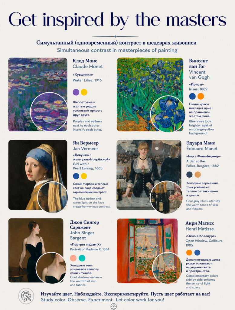
Many great artists used this principle deliberately.
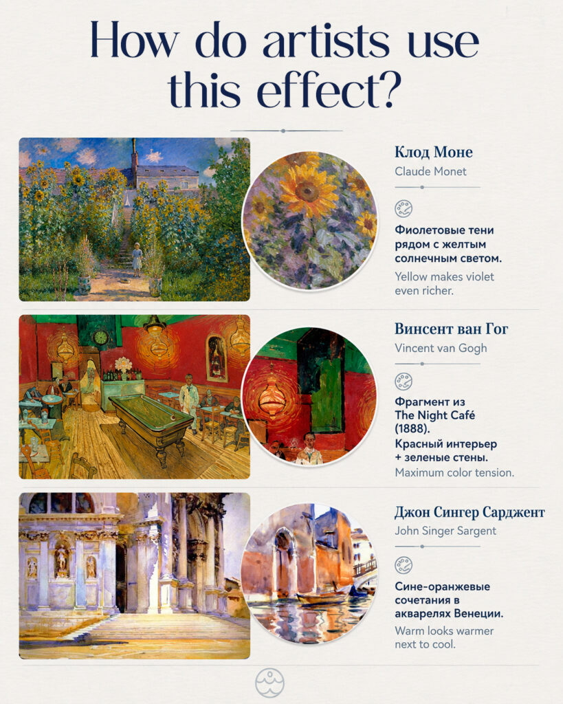
🎨 Claude Monet enhanced the sensation of sunlight by placing warm yellows and oranges against cool violet shadows.
🎨 Vincent van Gogh intentionally juxtaposed complementary colors to create emotional intensity and increase the expressive power of his paintings.
🎨 Henri Matisse built entire compositions around the interaction of contrasting color areas, making colors appear to glow beside one another.
For artists, this leads to several important conclusions:
✔ Never evaluate a color swatch separately from the painting.
✔ To make a color appear more vibrant, you don’t always need a stronger pigment — sometimes the right surrounding colors are enough.
✔ Light can appear brighter, shadows deeper, and water more luminous simply through effective color relationships.
This is why color theory is not only about choosing beautiful pigments, but also about understanding how colors interact with one another.
💡 Try a simple experiment: place a small gray piece of paper first on a red surface, then on a blue or yellow one. You may be surprised by how different the same gray appears.
Have you noticed similar effects in painting or in nature? 🎨💙