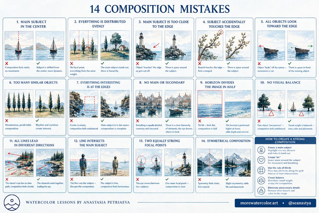
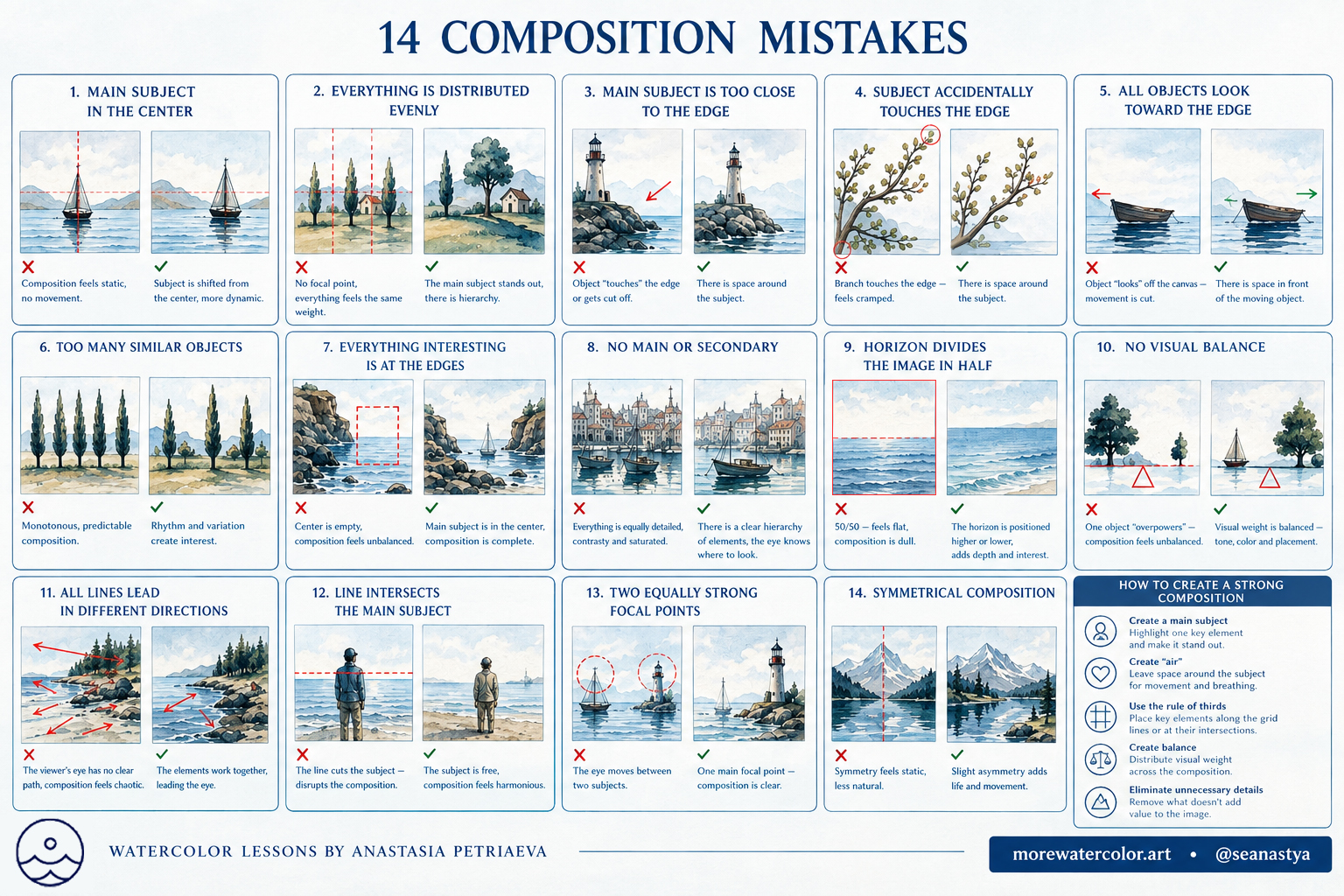
An appealing subject and beautiful colors do not always make a painting compelling: the viewer’s eye needs a clear path and a focal point. Explore 13 common composition mistakes in drawing and painting, with examples of how to fix them. These are guidelines, not strict rules: symmetry, repetition and centered subjects can all work when they support your artistic intent.
Professional artists can intentionally break the rules and create powerful, expressive compositions. What matters is understanding why you are making a particular compositional decision.
Contents
- Placing the Main Subject in the Center
- Distributing Everything Too Evenly
- Placing the Main Subject Too Close to the Edge
- Letting a Subject Accidentally Touch the Edge
- Leaving Too Little Space in Front of a Moving Subject
- Repeating Too Many Identical Objects
- Placing All the Interest at the Edges
- Letting the Horizon Divide the Image in Half
- Accidental Tangencies Between Objects
- Object Tangencies in Landscapes
- Running Compositional Lines Directly from the Corners
- Creating Two Equally Strong Focal Points
- Leaving Too Little Space in the Direction of the Gaze
Jump to the composition checklist
1. Placing the Main Subject in the Center
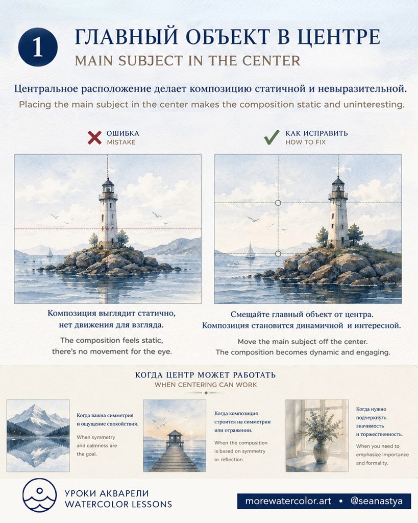
What goes wrong. Placing the main subject exactly in the center can make a composition feel static when the scene calls for movement or an off-center focal point.
How to fix it. Move the main subject off-center. Use the rule of thirds as a starting point, then adjust the placement to suit the scene.
When it can work. Centering can work well when symmetry, reflections, calmness or a sense of formality are part of your intent.
2. Distributing Everything Too Evenly
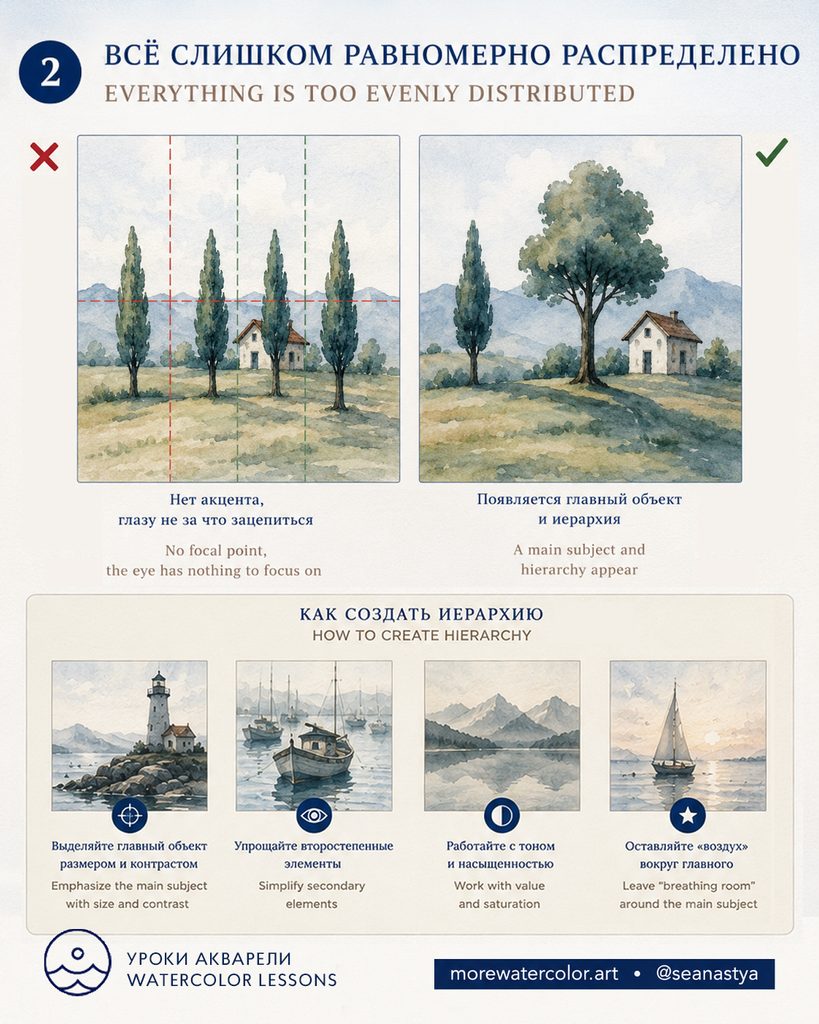
What goes wrong. When objects have similar spacing and visual weight, the eye has no clear focal point. Every element competes equally for attention.
How to fix it. Establish a main subject through size and contrast. Simplify secondary elements, vary value and saturation, and leave breathing room around the focal point.
3. Placing the Main Subject Too Close to the Edge
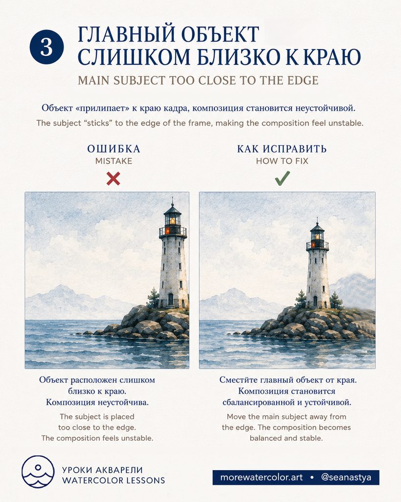
What goes wrong. A main subject placed unintentionally close to the edge can feel squeezed against the frame and make the composition unstable.
How to fix it. Move the subject farther inside the frame, leaving enough surrounding space for a balanced composition.
4. Letting a Subject Accidentally Touch the Edge
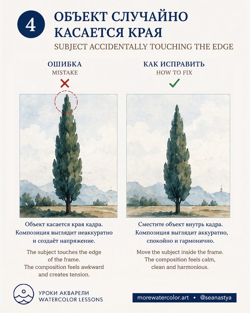
What goes wrong. When a subject just touches the frame, the contact can look accidental and create visual tension.
How to fix it. Move the subject inside the frame so there is a clear gap between its contour and the edge.
5. Leaving Too Little Space in Front of a Moving Subject
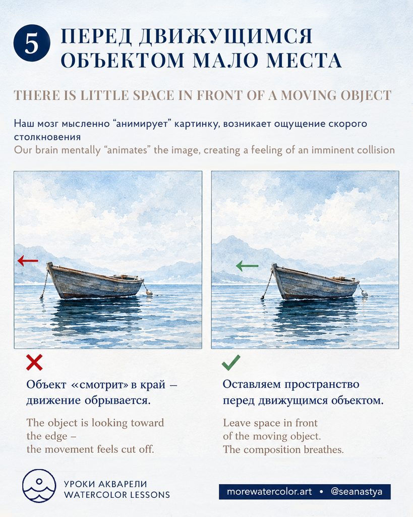
What goes wrong. The viewer anticipates movement. When a subject faces a nearby edge, its movement can feel cut off, suggesting an imminent collision with the frame.
How to fix it. Leave more space in the direction of movement. In the boat example, giving the bow more room makes the composition feel more open.
6. Repeating Too Many Identical Objects
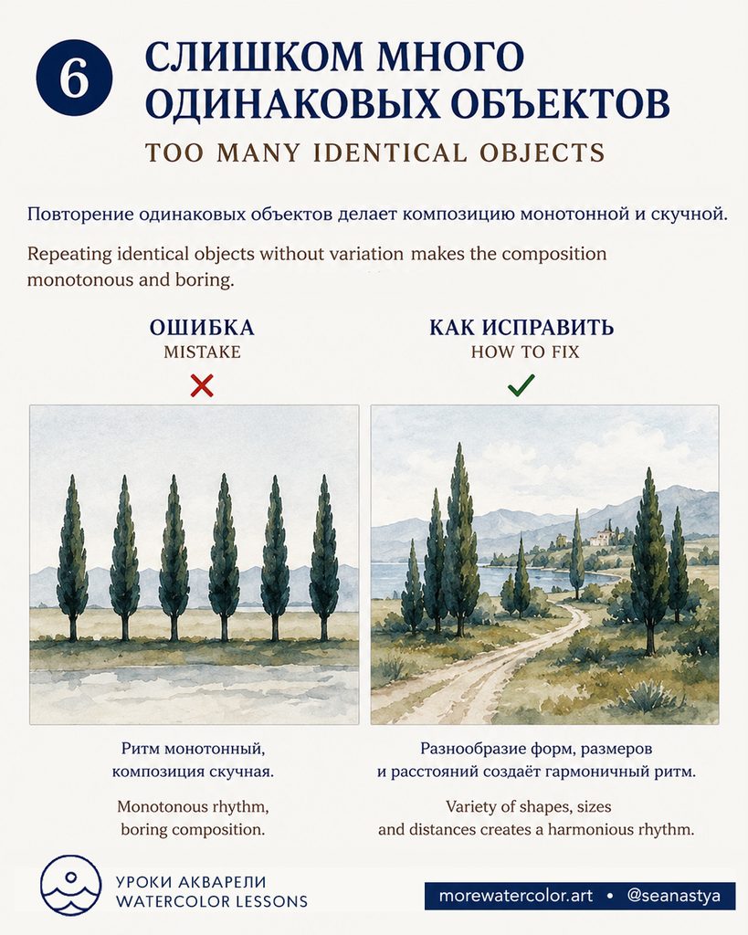
What goes wrong. Repeating objects of the same shape and size at equal intervals can create an unintentionally monotonous rhythm.
How to fix it. Vary shapes, sizes and spacing. Group some elements and separate others to create a more engaging rhythm.
When it can work. Regular repetition can be effective when a deliberate pattern or sense of order supports your idea.
7. Placing All the Interest at the Edges
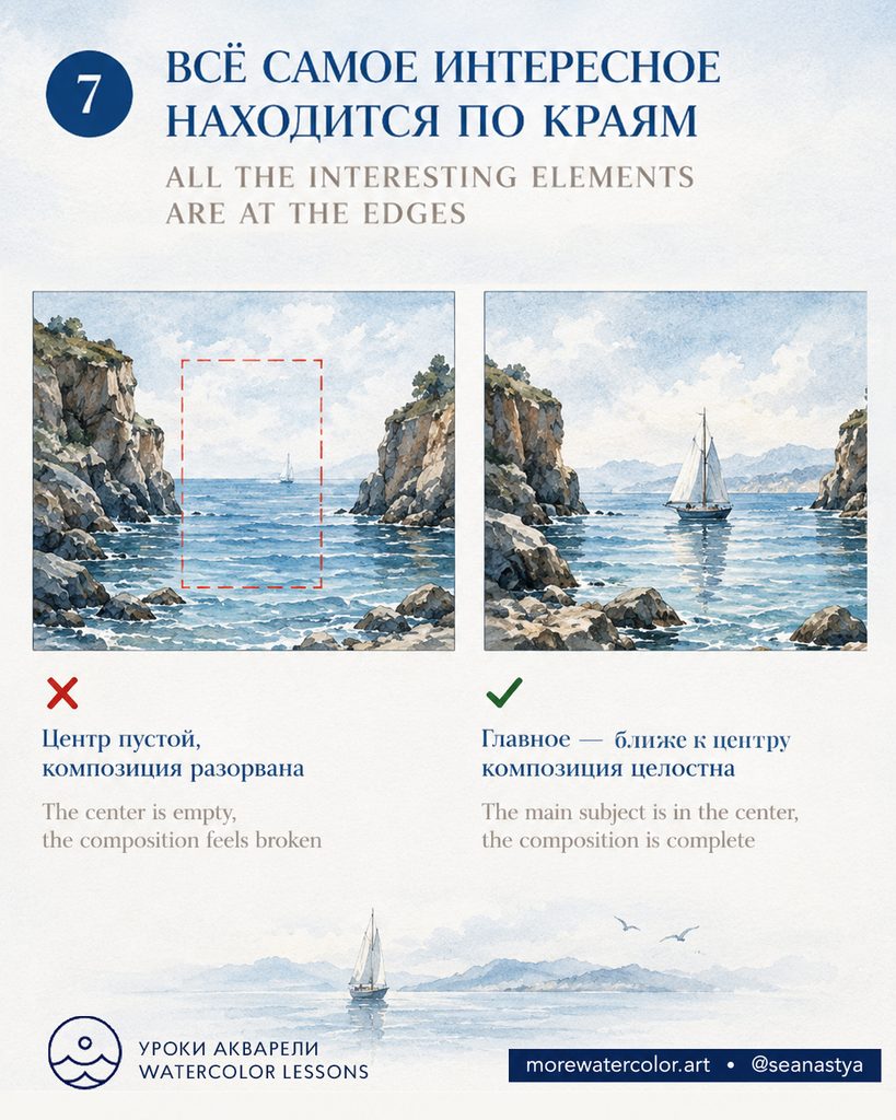
What goes wrong. When all the strongest details sit at the edges and the middle has no connecting role, the composition can feel disconnected.
How to fix it. Bring the main subject closer to the center to create a cohesive composition. It does not need to sit at the exact midpoint: the goal is to connect the elements and establish a clear focal point.
8. Letting the Horizon Divide the Image in Half
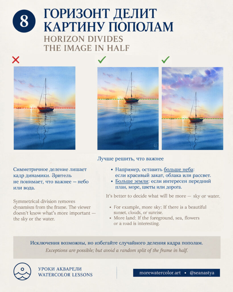
What goes wrong. A horizon placed at the midpoint can give equal importance to the sky and the area below it, leaving the viewer unsure where to focus.
How to fix it. Decide what matters most. Lower the horizon to emphasize a sunset, clouds or sunrise. Raise it to give more space to water, land or an interesting foreground.
When it can work. A centered horizon can work when you deliberately emphasize symmetry or reflections. Avoid dividing the image in half by accident.
9. Accidental Tangencies Between Objects
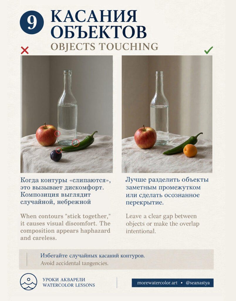
What goes wrong. When two contours barely touch, they can appear to stick together. These accidental tangencies make a still life feel awkward and harder to read.
How to fix it. Leave a clear gap between objects or overlap them deliberately so their spatial relationship is unambiguous.
10. Object Tangencies in Landscapes
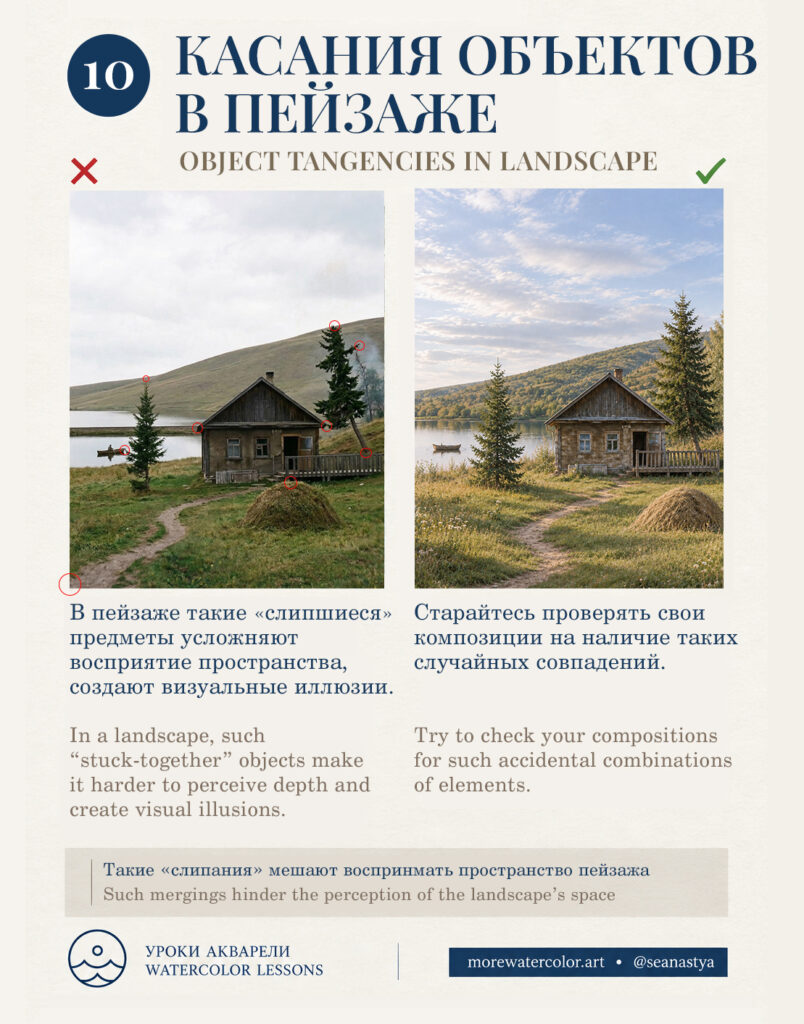
What goes wrong. Accidental alignments between trees, roofs, shorelines and landforms can merge separate elements and make depth harder to perceive.
How to fix it. Check the contours of foreground, middle-ground and background elements. Adjust their positions or shapes so that gaps and overlaps clearly communicate depth.
11. Running Compositional Lines Directly from the Corners
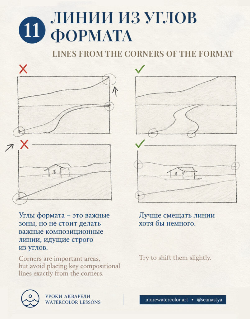
What goes wrong. A road, slope or other strong line that meets the frame exactly at a corner can create an unintended visual coincidence and draw attention away from the subject.
How to fix it. Shift the line slightly so it meets the edge away from the corner. Check where the main diagonals enter and leave the frame.
12. Creating Two Equally Strong Focal Points
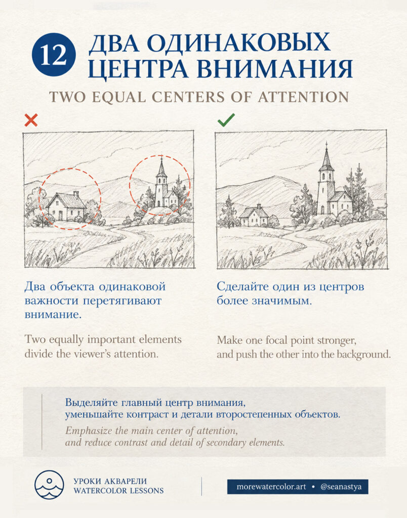
What goes wrong. Two equally prominent elements can divide the viewer’s attention, making it unclear which subject should lead.
How to fix it. Make one focal point stronger. Reduce the size, contrast or detail of secondary elements so they support the main subject rather than compete with it.
13. Leaving Too Little Space in the Direction of the Gaze
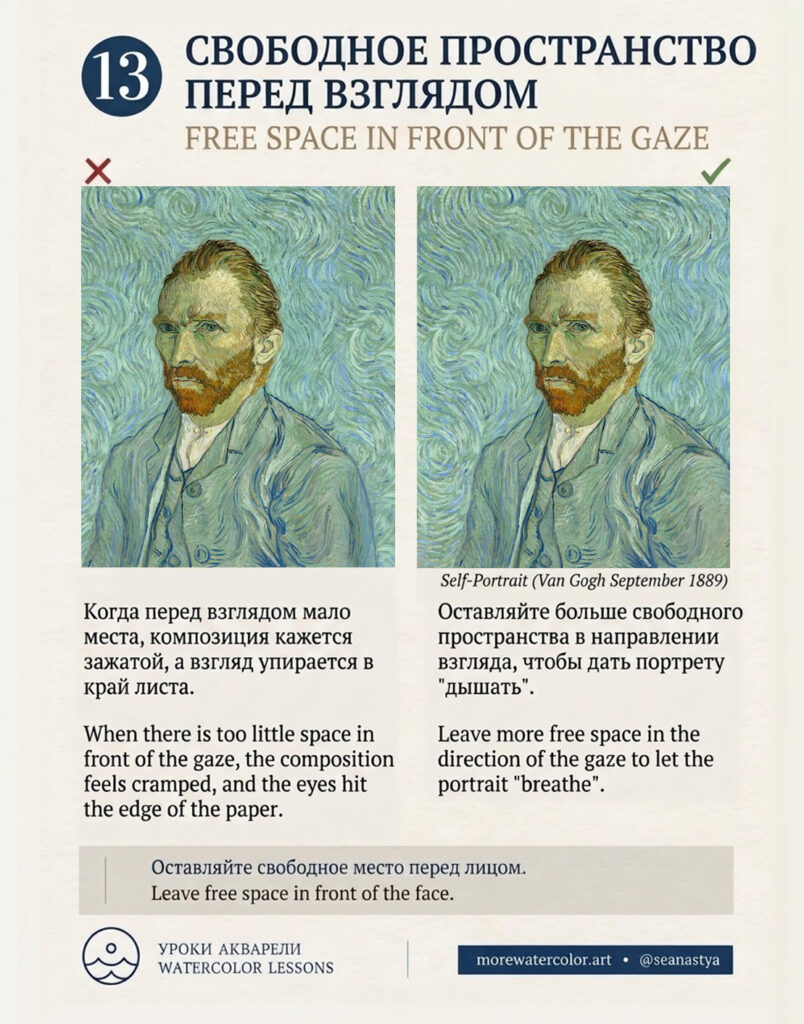
What goes wrong. When a face looks toward a nearby edge with little room in front of it, the portrait can feel cramped.
How to fix it. Leave more free space in the direction of the gaze. Adjust the crop or placement of the face to let the portrait breathe.
Illustration: Self-Portrait, Vincent van Gogh, September 1889.
Checklist: How to Review Your Composition
Step back from your work or view it as a thumbnail. Use this checklist to review the composition before adding more detail.
- ☐ A clear focal point. You can immediately tell what matters most.
- ☐ Visual hierarchy. Secondary elements support the main subject rather than compete with it.
- ☐ Intentional placement. Centered or off-center positioning supports your idea.
- ☐ Room near the edges. Subjects do not touch the frame accidentally or feel unintentionally cramped.
- ☐ Space for movement. Moving subjects have room in the direction they are heading.
- ☐ A purposeful rhythm. Repeated shapes, sizes and intervals create the effect you intend.
- ☐ A cohesive composition. Attention does not drift only to the edges; the elements feel connected.
- ☐ A deliberate horizon. It is clear whether the sky or the area below it matters more.
- ☐ Clear contours. Objects have clear gaps or intentional overlaps rather than accidental tangencies.
- ☐ Readable depth. Accidental alignments do not merge elements on different planes.
- ☐ Well-placed lines. Strong lines do not meet the corners unintentionally.
- ☐ A leading focal point. Multiple points of interest do not compete unnecessarily.
- ☐ Space for the gaze. There is enough room in front of the face in the direction it looks.
An unchecked item is a reason to review a choice, not necessarily to change it. What matters most is whether that choice supports your idea.
Download the Composition Guide
I’ve also prepared a downloadable composition guide that you can save and refer back to while painting.